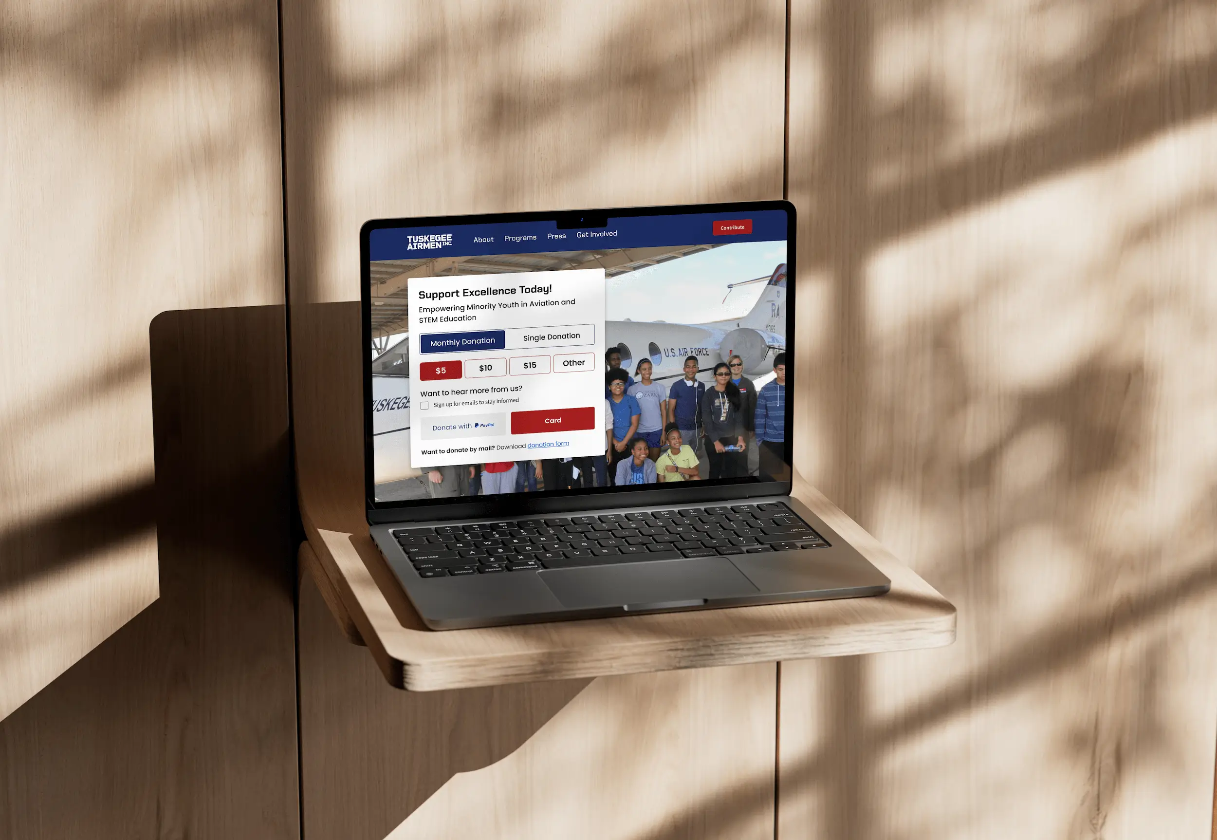
Tuskegee Airmen Inc. (TAI) is a nonprofit organization dedicated to preserving the legacy of African Americans who served in the Army Air Corps during WWII. Our redesign focused on enhancing clarity, usability, and creating graphic assets to strengthen their social media presence.
Duration
4 Months
Methods
UX/UI Design, Social Media
Role
Designer
CONTEXT
Challenge
The website was overloaded with information but lacked clear organization. Navigation was challenging for older, less tech-savvy users. In addition, the site did not effectively engage younger audiences, limiting overall communication.
Solution
We redesigned the website with an intuitive structure and clear visual hierarchy. Key improvements included streamlined navigation, enhanced accessibility features, and a consistent visual hierarchy. We also developed graphic assets for social media to improve audience engagement.
View Prototype 🔗IMPACT
40% Decrease
in website navigation time
80% Agreement
on main navigation structure from users
RESEARCH
We validated the problem with competitive analysis, user surveys, and card sorting exercises. This helped us focus on the most impactful areas for improvement.
Competitive Analysis
Analyzing similar nonprofit websites revealed effective navigation and content flow strategies. We also looked at educational nonprofits for modern UI inspirations.

User Surveys
We surveyed users across various age groups. The feedback highlighted unclear paths for actions such as donating or signing up, which discouraged engagement.
Likelihood to Engage (Donate/Volunteer)
Based on 10 user responses. 1 = Unlikely, 5 = Likely.
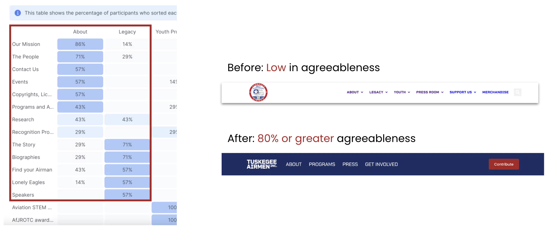
Card Sorting
Card sorting with board members revealed low agreement on subpage organization. We consolidated redundant tabs to achieve a more intuitive sitemap.
PRE-DESIGN PHASE
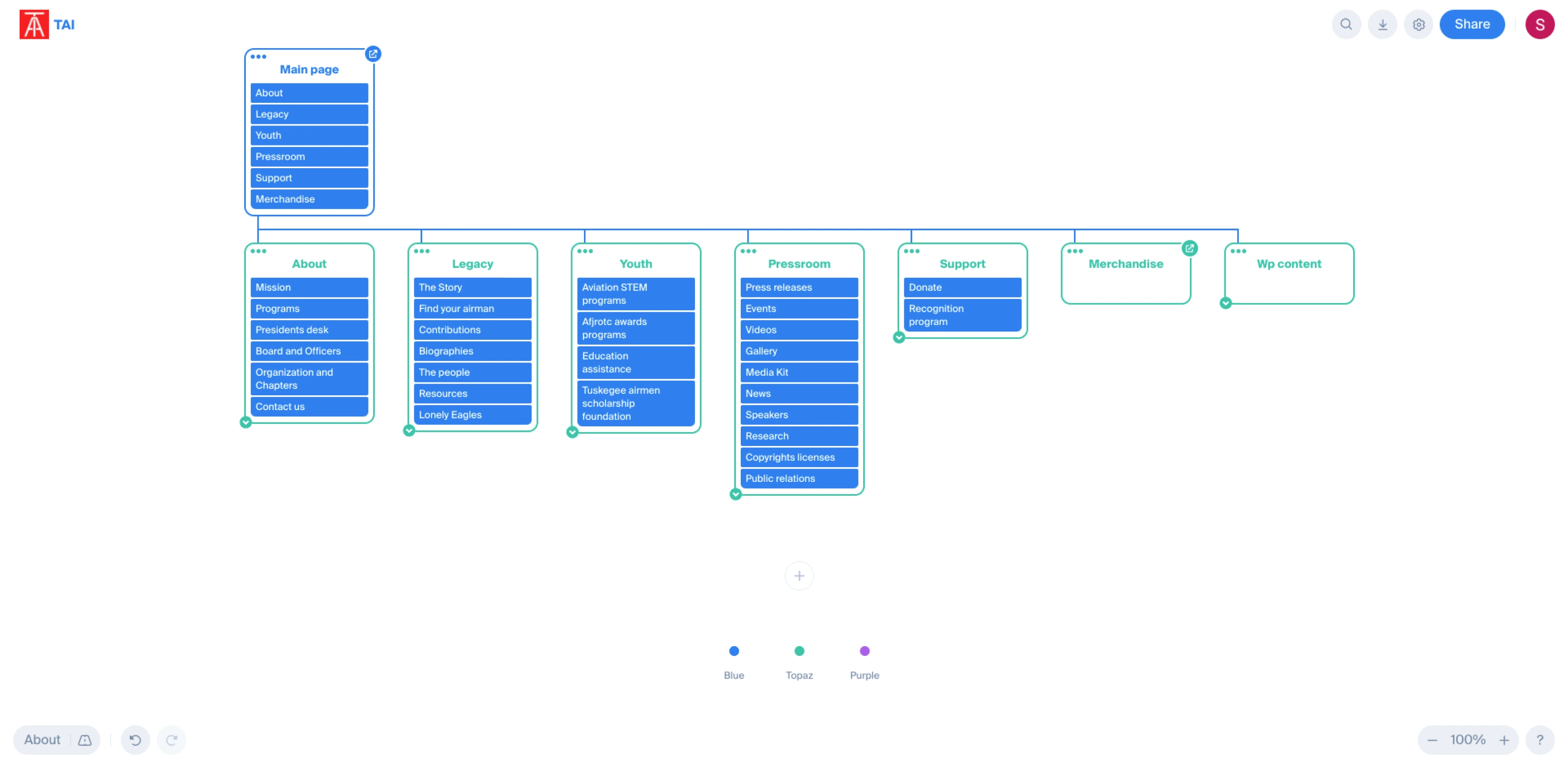
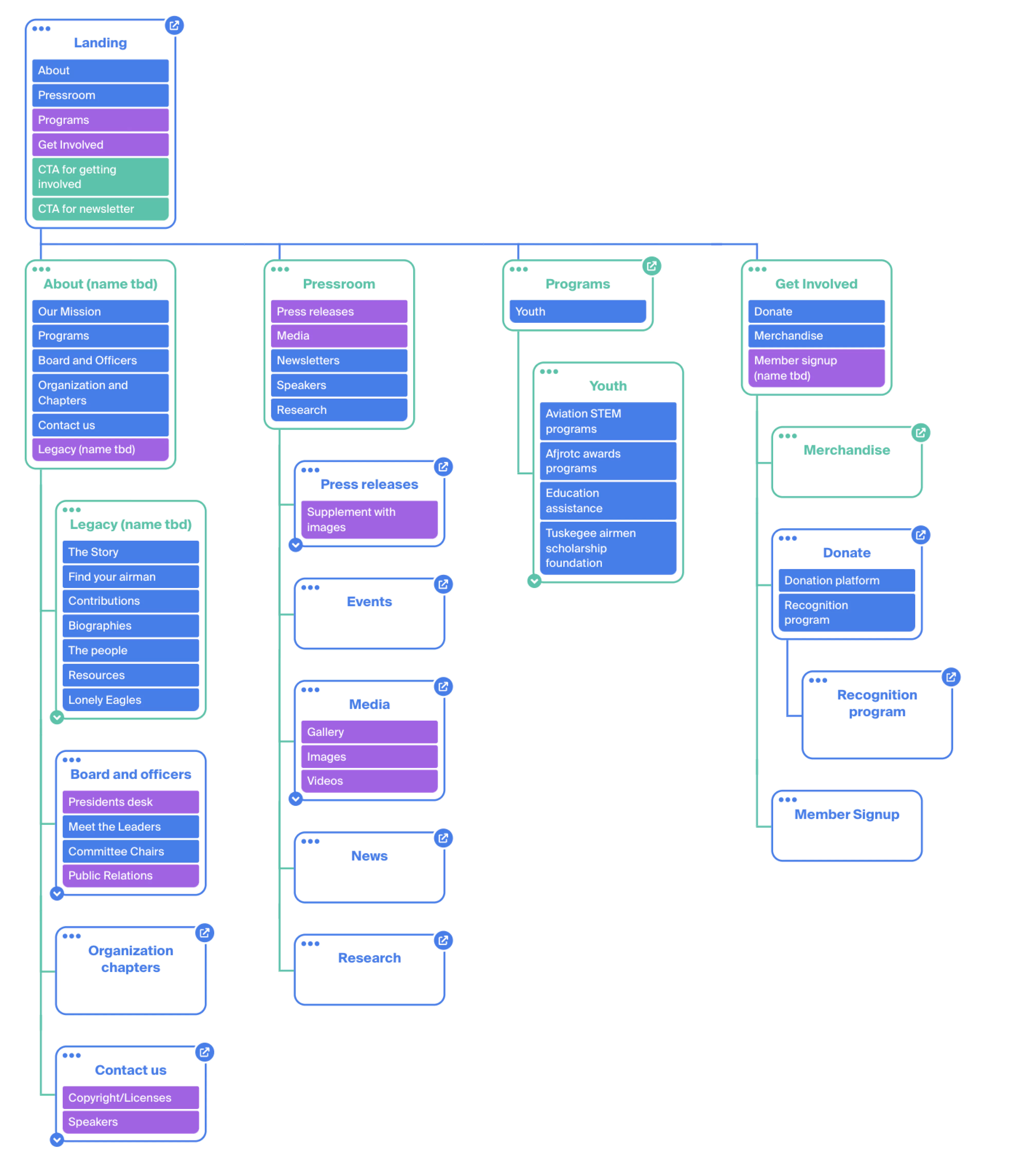
Sitemap Development
After analyzing user feedback and the current site structure, we developed a new sitemap. Our approach included conducting a thorough content audit, brainstorming sessions on Figjam, and integrating survey insights into design proposals.
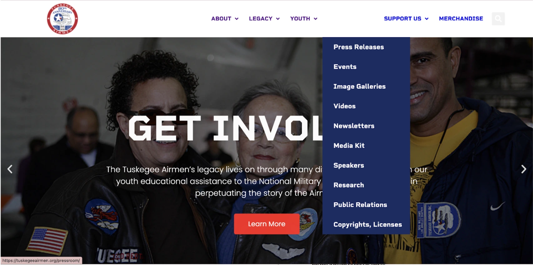
New Structure
We reorganized content into four main tabs: About, Programs, Press, and Get Involved, consolidating redundant pages. This simplified the navigation structure significantly.
DESIGN PHASE
With the new sitemap approved, we built a style guide and design system in Figma.
Style Guide
Our style guide used TAI’s brand colors and introduced a new font for improved readability. The red, white, and blue palette was retained, with red as an accent, to honor the organization’s heritage. Accessibility was verified using A11Y’s Validator Tool.
Color Palette
Typography
Display Large - Chakra Petch 57/64
Tuskegee Airmen
Display Semi-Bold - Chakra Petch 45/52
Tuskegee Airmen
Headline Large - Chakra Petch 32/40
Tuskegee Airmen
Sub Header Large - Poppins 22/28
Tuskegee Airmen
Iterating Design Concepts
Designers worked on desktop and mobile layouts concurrently. We prioritized visual consistency, readability, and simplifying key user journeys like signups and donations.
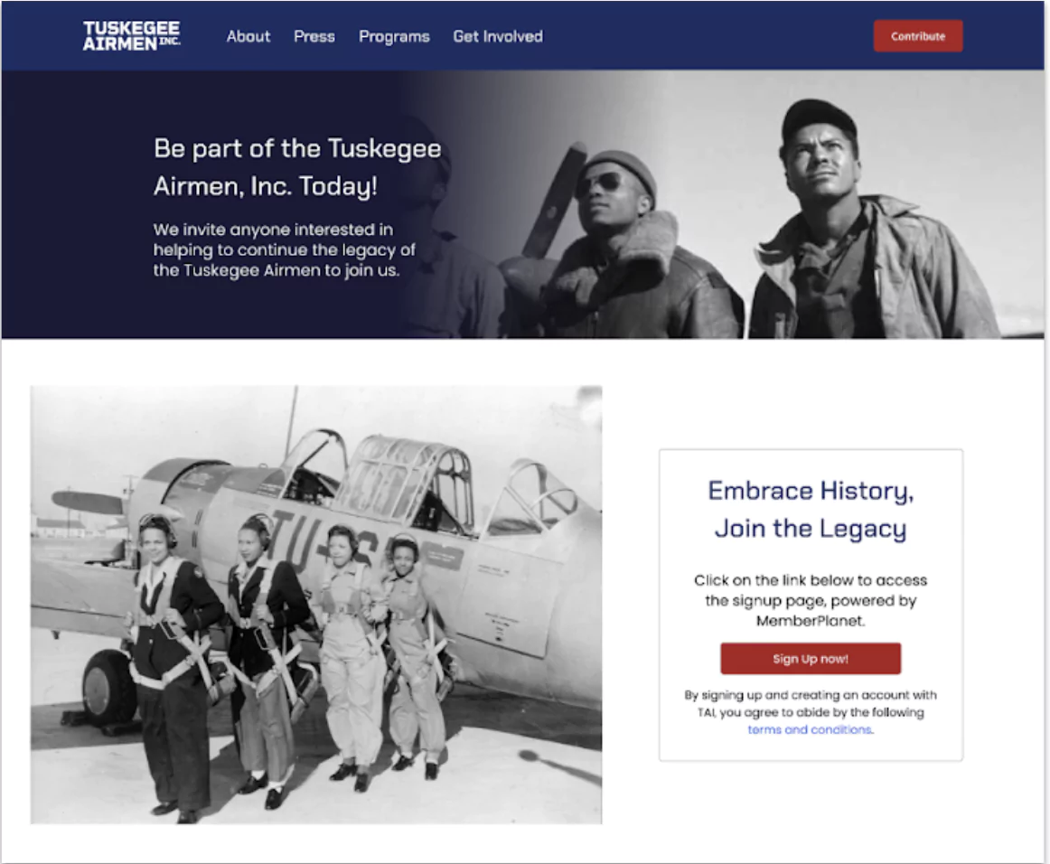
Signup Process Redesign
The original member signup process required multiple steps. We streamlined it into a single, clear call-to-action. The redesigned "Get Involved" tab now directs users to MemberPlanet with one click.
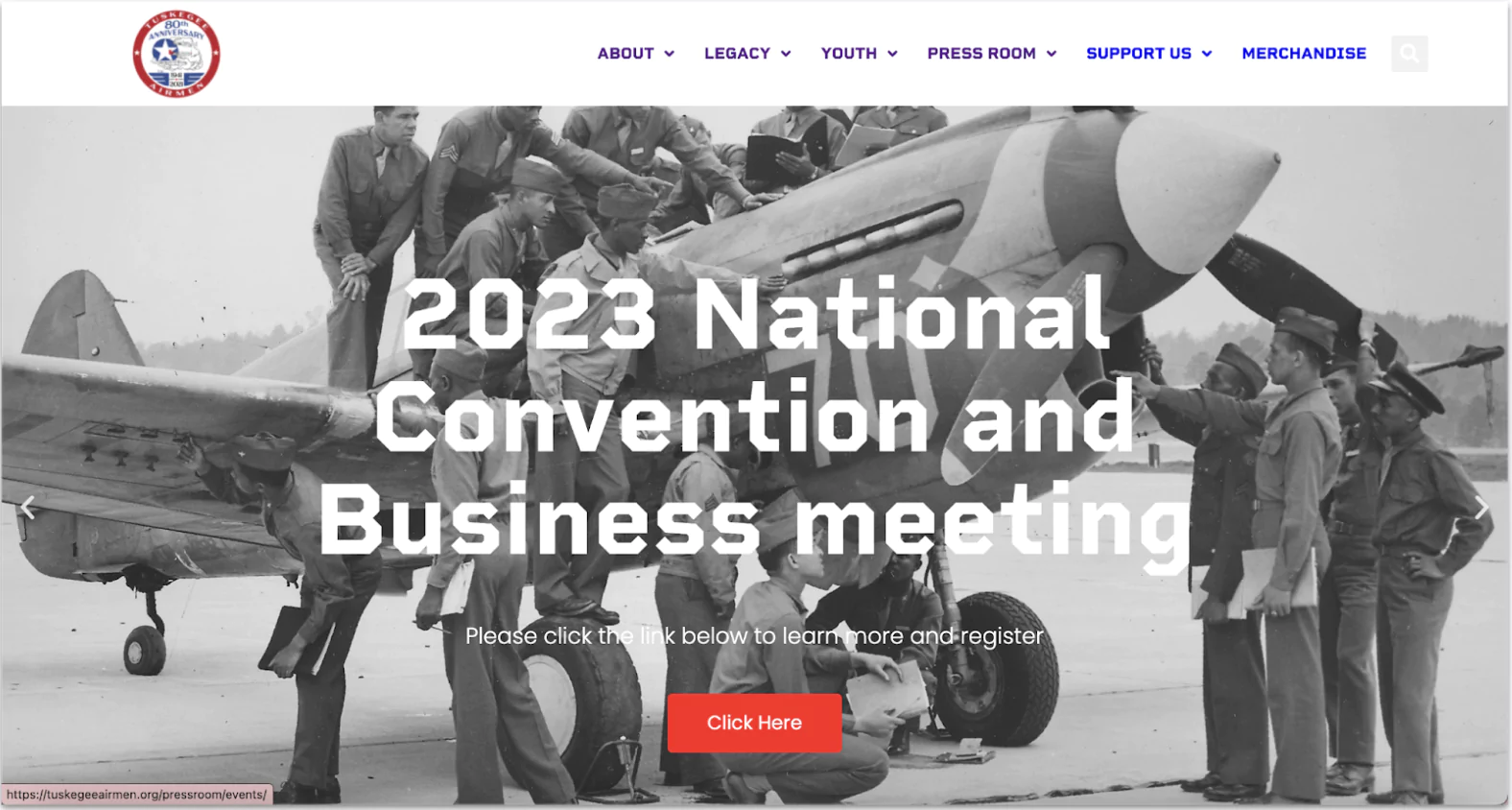
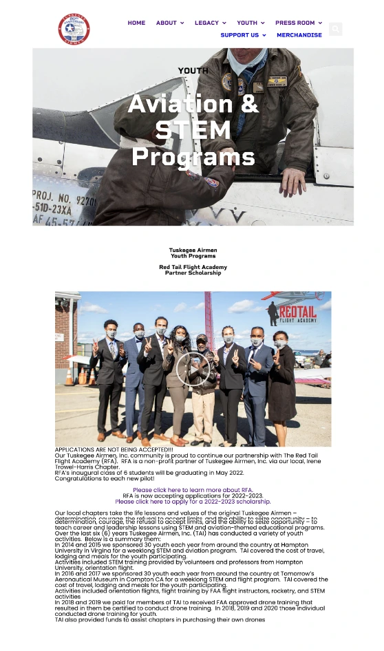
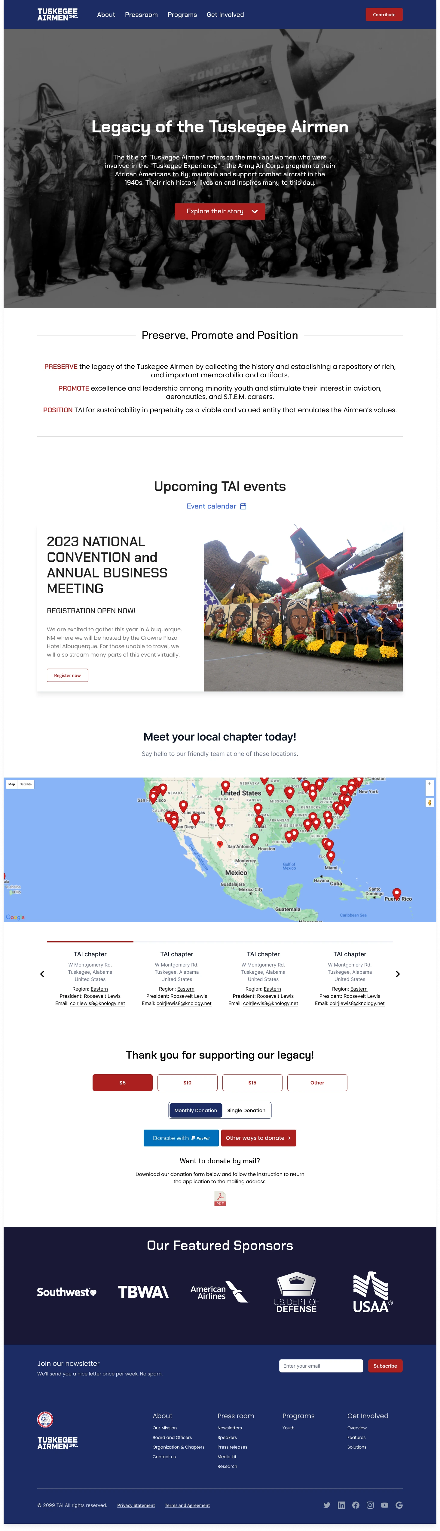
Programs Page Redesign
Previously, programs were presented in dense text blocks with little hierarchy. The new Overviews page uses media, banners, and improved spacing to showcase Programs, Scholarships, and Awards effectively.
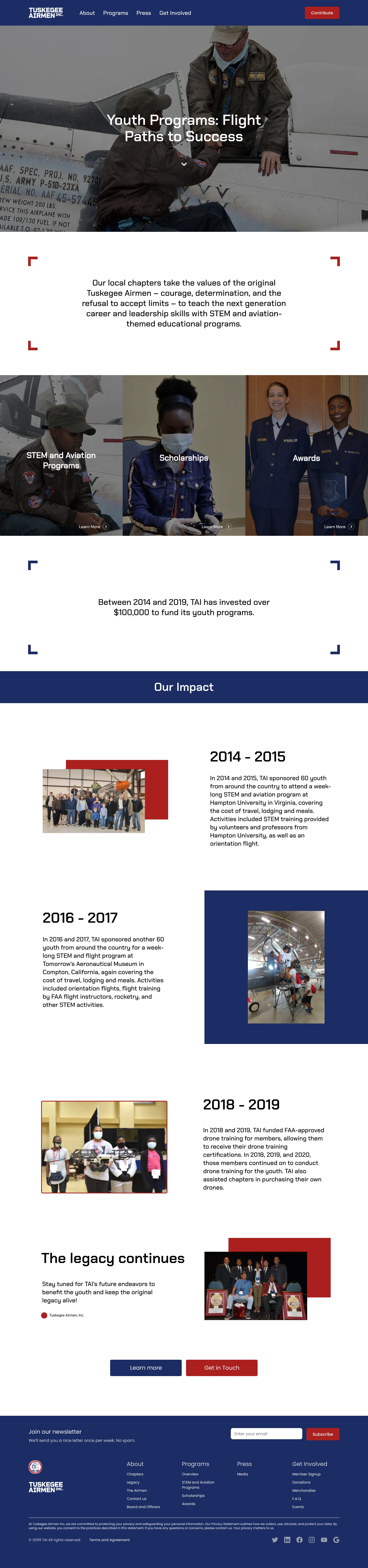
Landing Page
Additional banners highlight individual programs and yearly accomplishments.
User Testing
After creating a medium-fidelity prototype, we conducted user testing with timed tasks. Results showed a 40% faster navigation time, allowing us to fine-tune the high-fidelity designs.
User Testing Results (Time on Task)
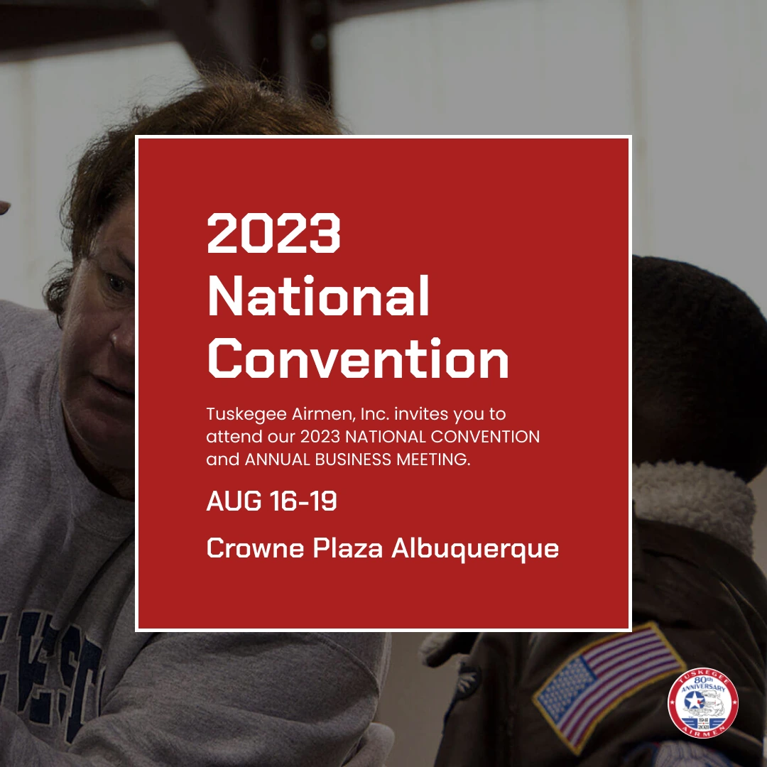
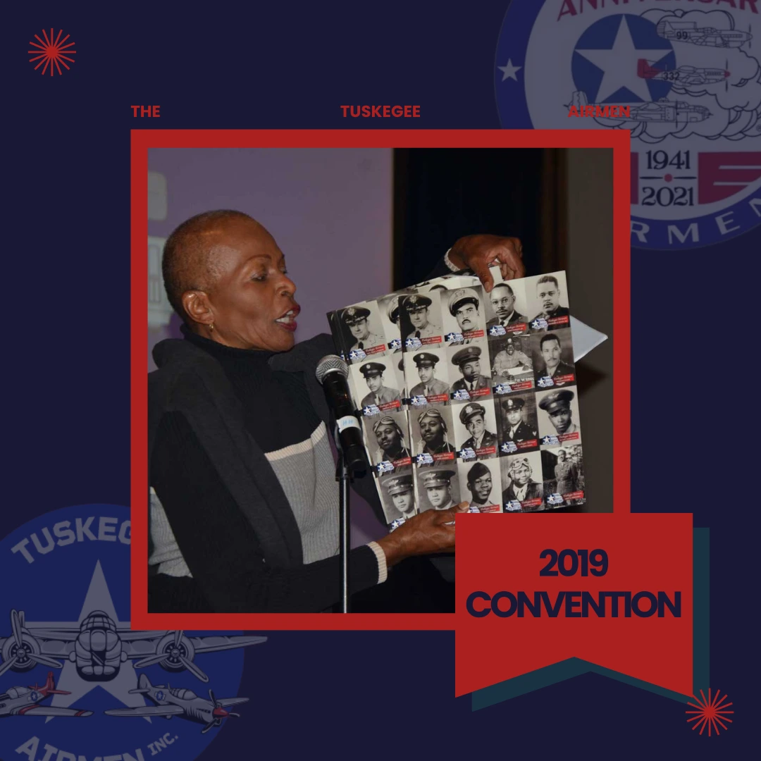
SOCIAL MEDIA
To jumpstart TAI’s social media initiatives, we focused on consistent branding and creating a Social Media Handbook with a content calendar and best practices.
Templates
Our team brainstormed content topics and created templates on Canva for event announcements and photos.
RESULTS
Improved Navigation
Redesigned information architecture made it easier for users to find what they need.
Accessibility
Ensured the website met WCAG guidelines, improving usability for all users.
Responsive
The site is now fully optimized for desktop, tablet, and mobile devices.
Next Steps
With the design vision established, TAI can now move forward with development. Future steps include refining the user experience based on post-launch feedback, implementing a content strategy for regular updates, and monitoring performance metrics.
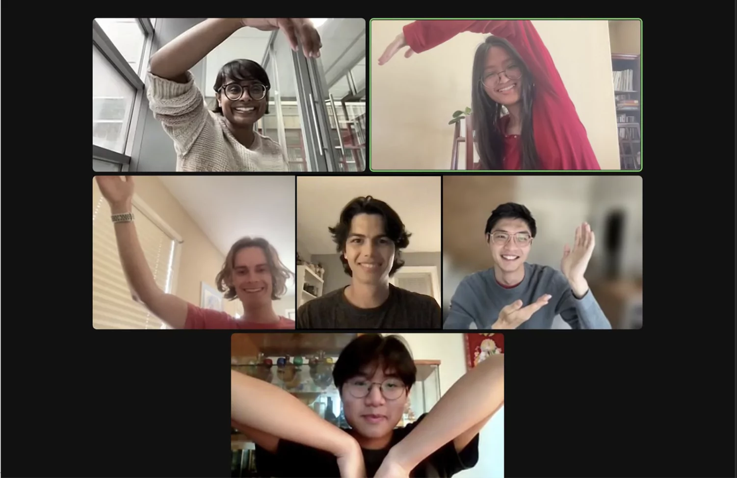
MEET THE TEAM
Clara Truong
Design/Product Manager
Tyson Cheung
Designer
Apoorva Makarla
Designer
Caleb Moran
Designer
Steve Sheng
Designer
Gabriel Wong
Designer
We’d like to thank Develop for Good, especially Mary, Amanda, and our Project Lead Wesley, for this collaborative experience. Special thanks to our mentor, Jack Wang, for his invaluable guidance.